
Your Website Isn’t Giving Clients a Reason to Choose You (Here’s Where to Find It)
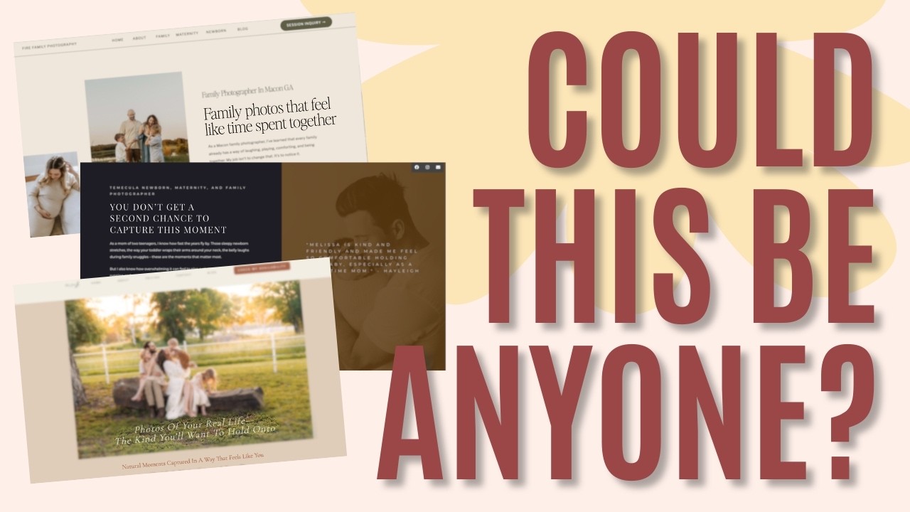
Does your website give clients a reason to choose you? Here’s a quick test. Cover up your name and logo, then read your homepage like a stranger would. Could they still tell it’s yours?
For most photographers, the honest answer is no. Not because their work isn’t distinctive, but because their words sound like everyone else’s. I know because I did the same thing on my own photography website for years.
I’m Kate, founder of Dear Kate Brand Strategy. These days I help photographers and service providers build websites that book clients, and this is one of the most common problems I see. The good news: you probably don’t need to change anything about who you are. You just need to stop hiding it.
Prefer to Watch Instead of Read?
In the video, I review three real photographer websites and show where each one’s difference was hiding:
Why Your Website Sounds Like Everyone Else’s
Somewhere along the way, we all learned the same script. Capture the moments. Freeze time. They’re only little once. Embrace the beautiful chaos.
It works on heartstrings, which is why everyone uses it. But when every photographer in town says it, the words stop helping a client choose. They all blend into one long, lovely paragraph. And when nothing stands out, price becomes the tiebreaker, which is exactly why clients keep choosing the cheaper option.
You might be thinking your photos do the talking. And to you, they do. You can see that your greens run a little warmer or your tones a little more muted. Your clients can’t. They don’t have your eye, so they need you to spell out the difference in words and give them a clear reason to choose you.
You Don’t Need a New Angle. You Need to Dig Up Yours.
When photographers hear “differentiate yourself,” they usually go looking for something clever to invent. A new niche, a quirky tagline, a gimmick.
You don’t need to blaze a new trail. What makes you different is almost always already on your website. It’s just tucked away on your About page, in a blog post from three years ago, or in a fun fact nobody thinks matters.
When I looked at the three sites in the video, all of them were beautiful and well written. And on every one, the most interesting, specific details were sitting several clicks away from the homepage.
Three Places Your Difference Is Hiding
1. In the small details of how you live
Stephanie Gardner’s homepage talks about natural moments and real life, the kind of language most family photographers use. But her About page tells you she calls herself an observer. She spends her free time outside with her kids collecting sticks and drawing with chalk. She’d pick a quiet morning at the lake over a big community event any day.
On their own, those are cute fun facts. Put together, they explain her photography. She loves quiet, ordinary moments with her people, so of course she cares most about the in-between shots: the second before everyone looks at the camera, the laugh nobody planned.
The takeaway: a personal detail earns a spot on your homepage when it tells the client what you’ll notice about their family. Nobody needs to know you collect sticks. They do want to know you’re the kind of person who sees the small stuff.
2. In the story behind why you do this
Melissa of Fire Family Photography already has a stronger message than most: she’s there to notice how your family laughs and comforts each other, not to change it. But the reason she believes that lives on her About page.
When she looked back at photos of her boys growing up, she realized there were plenty of them and very few of her with them. That changed how she thinks about family photos. They’re not only for you now. They’re for your kids later, when they want to see what life looked like with their mom in it.
The takeaway: a story gives your process a reason. Once you know Melissa’s, her details about choosing relaxed locations and planning around your family’s personality stop sounding like logistics. They sound like a philosophy.
3. In what you’ve lived through
Melissa Lynn’s site feels established and high-end, and her offer clearly stands out: she takes the stress of planning off your plate and creates heirloom wall art, not just digital files. What the homepage doesn’t tell you is why she’s the one to trust with it.
Keep reading and you find out she’s been photographing families for more than 20 years. Her own kids are now 19 and 16. Some of her clients have booked her every year for over a decade, so she’s watched their babies grow up too.
Now “the years go by so fast” isn’t a line every photographer uses. It’s coming from a mom on the other side of those years.
The takeaway: experience turns a cliché into something believable. The same sentence lands differently when you know who’s saying it and what they’ve seen.
What This Looks Like on a Homepage
Here’s a rough before-and-after to show the shift. This isn’t copy from any of these sites, just an illustration of the idea:
Before: I capture the beautiful chaos of family life, because they’re only little once.
After: I’ve photographed families for more than 20 years, and my own kids are nearly grown now. I know which moments you’ll want back, and they’re rarely the posed ones.
Both are kind and warm. Only one of them could belong to just one photographer.
How to Find Your Reason to Choose You
Instead of asking, “What can I say that sounds different?” ask this:
What’s already true about me, my experience, or the way I work that my competitors couldn’t say in exactly the same way?
Then go digging:
- Reread your own About page and old blog posts. Highlight anything specific that never made it to your homepage.
- Connect each detail to the client. Finish the sentence “Because I ___, you get ___.” If you can’t finish it, the detail can stay on your About page.
- Look for your story. Why do you photograph people this particular way? There’s usually a moment behind it. (Here’s more on making your marketing stand out by sharing your past.)
- Count your experience. Years in business, families you’ve photographed, repeat clients. If it builds trust, put it where new visitors will see it.
- Move the best of it up. Your difference belongs near the top of the homepage, not five clicks deep. This homepage framework shows exactly where it fits.
Then run the logo test again. When a stranger can tell whose website they’re on without seeing your name, you’ve given the right clients a real reason to choose you, and made yourself their easy yes.
Want Help Finding What Makes You Different?
This is exactly the work I built Scout to do.
Most branding exercises start with your ideal client or what your competitors are doing. Scout starts with you. It asks about your experience, your stories, your values, and the way you work, one question at a time. Then it connects the dots you might not see on your own.
When you’re done, you’ll have a 20+ page Marketing Field Guide that includes:
- Messaging pillars and brand voice
- Your brand stories
- Offer descriptions
- A color palette, font system, and custom moodboard
It’s the same digging we did on these three websites, guided step by step, so you can bring what you find straight to your homepage.
Ready to Plan a Website That Actually Books Clients?
Once you know what makes you different, the next step is building a website that puts it front and center. Start with a plan before you touch your design.
The DIY Website Planner
Plan, design, and launch a website that actually gets you clients, without the overwhelm.
This free, workbook-style planner walks you through three phases:
- Strategy: plan your offers, brand voice, and content so your right-fit clients know they’re in the right place
- Design: build your site so every section has a job, and it still looks great
- Launch & SEO: set up your SEO so Google can send ready-to-book clients your way
It’s the roadmap I wish I’d had when I built my first site.
Whether I’m behind the lens or behind a screen, I’m all about finding simpler, smarter ways to grow a sustainable business — with clear messaging, clean design, solid boundaries, and a little help from AI.
Because between carpools, practice runs, and Knowledge Bowl meets, I need a business that works even when I’m not.
Grab my free website training to learn how to make your site your hardest-working team member.
Hi, I’m Kate — brand strategist, web designer, and yes, still a working photographer.

View comments
+ Leave a comment