
What to Put on Your Service-Based Business Homepage (A Simple Framework)
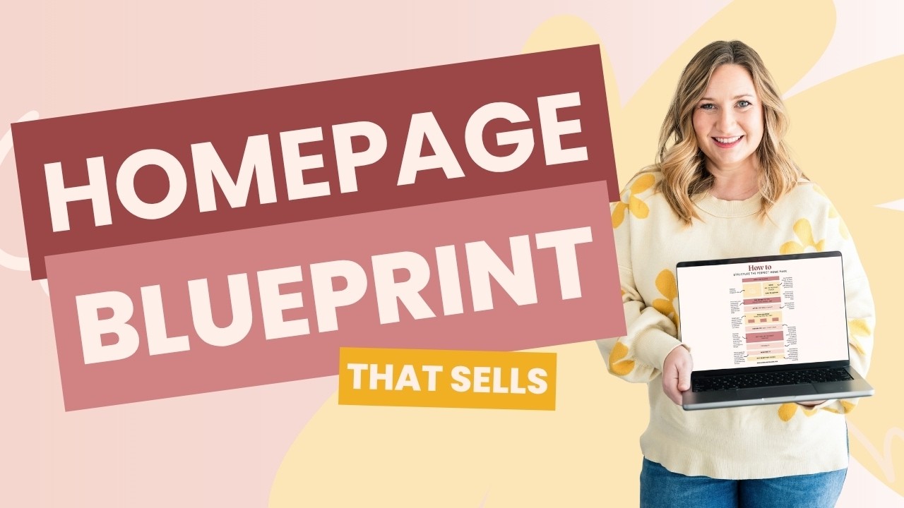
If you’ve ever tried to write your own service-based business homepage, you’ve probably hit one of two walls.
Either you have way too much to say, so you try to fit your services, your process, your story, a testimonial, your latest freebie, and buttons pointing in six directions onto one page. Or you have no idea what to say, so you add a nice photo, a line like “Helping you step into your next chapter,” and a Learn More button, and hope people figure it out.
Those look like opposite problems, but they’re the same one. Both make the visitor do too much of the work.
I’m Kate, founder of Dear Kate Brand Strategy. I help service-based business owners build websites that book clients, and in this post I’m sharing the framework I use as my starting point for every service-based business homepage, plus how to turn it into copy that actually sounds like your business.
Prefer to Watch Instead of Read?
In the video, I walk through the framework and then build a full homepage for a fictional wedding planner, from strategy to copy to a finished Showit template:
What a Service-Based Business Homepage Is Actually For
Your homepage is where people get the lay of the land. In a few seconds of scrolling, they need to figure out:
- What you do
- Whether it’s for them
- Why they might want to work with you
- Where to go next
That means your homepage copy has a real job. It’s not there to fill space in your design or to stuff in keywords. It’s there to guide someone through your business. (Want to see what happens when the order is off? Here’s a real homepage review.)
Start With Strategy, Not Sections
Before you decide what goes where on your service-based business homepage, you need to know what you’re trying to say. That means getting clear on:
- Who you’re talking to
- What they want
- What you’re offering them
- Why they’d choose you over another business
- What your business should sound like
You can absolutely work through these on your own. The tricky part is that it’s hard to see what’s interesting about your business when you’re the one living it. The things that feel normal to you are often exactly what would give someone a reason to choose you.
That’s why I built Scout. It walks you through a series of questions about your experience, your zone of genius, and your why, then connects the dots into a Marketing Field Guide. You’re not inventing a clever angle. You’re finding the difference that’s already there.
For the example in the video, I used a field guide for a fictional destination wedding planner named Catherine. It’s 29 pages long, and obviously not all of it belongs on her homepage. The next step is deciding what someone needs to know when they land, and in what order. That’s where the framework comes in.
The Homepage Framework: Seven Questions Your Visitor Is Asking
Notice that this framework isn’t a list of sections every website “has to have.” I’m not thinking, “We need an About section, then Services, then Testimonials.” I’m thinking about the questions the person on the other side of the screen needs answered, in the order they’ll ask them.
1. “Am I in the right place?” (The hero section)
When someone lands, they want to know whose website this is, what you do, and whether you can do it for them. They don’t need your whole story yet. They need enough to get oriented and decide to keep reading.
Aim for a clear headline, enough context to show what you do and who it’s for, and a next step for anyone who’s already ready.
2. “Do you get me?” (Before and after)
Before people care about your solution, they need to recognize themselves in what you’re saying. This section connects where your client is now with where they want to be.
And you can do that without six paragraphs of poking at their pain points. A few honest sentences go a long way.
3. “How can you help me?” (Your offers)
Now introduce your solution. That might be one signature service, a few ways to work together, or an overview that sends people to detailed service pages.
Your homepage doesn’t need to explain everything that’s included. Its job is to help visitors see which path is for them and why they’d want it.
4. “Does this actually work?” (Proof)
Testimonials, results, client work, numbers, credentials: whatever makes sense for your business.
Don’t think of proof as one testimonial section to check off. Use it anywhere someone might need a little more confidence to keep scrolling.
5. “Why you?” (What makes you different)
Chances are you’re not the only photographer, bookkeeper, or therapist your visitor could hire. This is where the strategy work pays off. If you’re stuck here, this post walks through where your difference is usually hiding.
Think of it as an About section, but not “here’s my name and three fun facts.” It’s “here’s what you should know about me that actually matters to your decision”: how you think, how you work, or how you deliver results differently.
6. “What do I do next?” (A clear call to action)
If someone has made it this far, don’t make them hunt for the next step. Book a call, fill out the inquiry form, view services. Whatever it is, make it obvious.
7. “I’m not ready yet.” (A way to stay connected)
For visitors who aren’t ready to book, offer another way to stay in touch, like your email list or a genuinely useful free resource.
Turning Strategy Into Homepage Copy
Once the framework is in place, you pull the right pieces from your strategy to answer each question. For Catherine, three parts of her field guide did most of the heavy lifting:
- Why she’s a better choice. She’s lived the same kind of experience her couples are going through. Her corporate events background shapes how she handles logistics. And she doesn’t just book vendors, she builds teams around each couple’s vision and values.
- Her clients’ before and after. Before, couples want something unique but don’t know where to start, and they need help without losing control. After, they feel calm and excited, and their wedding reflects their actual story.
- Her brand voice. Calm, confident, warm, and strategic. Explain the why behind recommendations. Never oversell.
From there, the hero section came together like this:
Destination Wedding Planning: Your Dream Wedding Without the Overwhelm
For accomplished couples who want authentic celebrations without the chaos.
Book a Free Discovery Call
And one line from the before-and-after section turned out to be the heart of the whole page: “What if you could stop coordinating and start celebrating?”
Website Copy Isn’t High School English
Writing for a website follows completely different rules from the essays we learned to write in school. People aren’t reading every word. They’re scanning, skipping around, and avoiding walls of text.
A few things I kept in mind while editing Catherine’s homepage:
- Write like a conversation. Short sentences, plain words, and a voice that sounds like a real person.
- Don’t dwell on the problem. My first draft of the “before” section felt long and heavy, so I cut it down and moved faster to what’s possible.
- Give one choice, not two. Where a section offered two buttons, I changed it to a single link to the contact page.
- Check your headline against your strategy. The first version of the hero was fine, but I went back to the field guide to make sure it showed why someone should pick Catherine over another planner.
There’s a lot of strategy underneath what looks like simple copy. That’s why I built Website Writer AI with conversion copywriting principles and this homepage framework built in. You give it your field guide, and it drafts your homepage section by section. It even tells you what’s missing, like testimonials you haven’t added yet. Then you edit it yourself or ask it to revise.
Write the Copy First, Then Design
This is the step most DIYers do backward. They pick a template and try to cram their words into the empty boxes.
I do it the other way around. Once the copy is written, I put it into a template and adjust the design to fit the message. In the video, that meant:
- Giving that “stop coordinating and start celebrating” line its own text box so it stands out
- Deleting a section the page didn’t need
- Removing a third service card, since Catherine only offers two
- Adding text boxes where the copy needed more room
It works both ways, too. Sometimes once the words are on the page, you realize a section is too long and go back and trim the copy. Sometimes the design needs to shift for the message to make sense. That back-and-forth is normal, and it’s how you end up with a site that looks good and reads well.
It also helps to start with a template built on the same framework. The templates in my shop are set up with sections that follow this flow, so your strategy has a natural place to land.
Your Homepage Isn’t a Fill-in-the-Blank
You shouldn’t have to sit down and magically know how to write your service-based business homepage. And it’s not about filling the empty boxes in a template with something that sounds nice.
When you start with strategy, you already know what matters to your people, what makes you different, and what you need to say. The homepage becomes a matter of putting those pieces in the right order.
By the time someone reaches the bottom of the page, they should be thinking: Yep, this is for me. They get it. And I know exactly what to do next.
Tools From This Post
Want to build your homepage the same way? Here’s everything I used:
- Scout: uncover what makes you different and turn it into a complete Marketing Field Guide
- Website Writer AI: turn your field guide into homepage copy, section by section
- Showit templates: strategy-first templates built around this framework
- Showit: the website builder I use and recommend for creatives and service providers (here’s my full Showit review)
Some of the links in this post are affiliate links. This means I may receive a small commission if you make a purchase through one of these links, at no extra cost to you. I only recommend products and services I personally use, trust, and genuinely believe will benefit my audience. Thank you for supporting my work and helping me continue to provide helpful, free content.
Whether I’m behind the lens or behind a screen, I’m all about finding simpler, smarter ways to grow a sustainable business — with clear messaging, clean design, solid boundaries, and a little help from AI.
Because between carpools, practice runs, and Knowledge Bowl meets, I need a business that works even when I’m not.
Grab my free website training to learn how to make your site your hardest-working team member.
Hi, I’m Kate — brand strategist, web designer, and yes, still a working photographer.

View comments
+ Leave a comment