5 Showit Templates for Family Photographers

For photographers, having a website is an essential tool for success. Showit provides photographers with an easy and efficient way of creating a website. No code; no sacrificing design. Showit designers offer templates with all the features you need to create a professional website with ease. The templates are fully customizable so you can make sure that your website looks exactly how you want it to.
The Showit platform was built with photographers in mind. If you are comfortable in Photoshop, a lot of the same tool concepts carry over. Better yet, you get full drag-and-drop control over your site design. A good template will give you a strong starting place to create your site, then you can fine-tune it to your needs.
I’ve selected my 5 favorite Showit templates that are perfect for family photographers. Whether you’re starting out or looking to update your existing site, these templates will have you up and running in no time. Keep in mind, it’s incredibly easy to change fonts and colors within Showit so you can stay on brand.
These Showit templates are all optimized to help you get found. They also help you make sure you’ve got the right content that gets your website visitor booking!
Love the look of these templates but need help getting it all setup? I offer done-for-you template customization as well as Brand Base Camp
1. Luna Joy by Dear Kate Brand Strategy (yes me 😉 )
If you’re a photographer who wears a few hats—family sessions, branding, maybe even a few weddings—Luna Joy was made for you. This modern, editorial-style template is designed to help you showcase multiple specialties without feeling cluttered or overwhelming. With bold typography, playful touches, and strategic layouts, it guides your visitors through your portfolio, services, and blog in a way that feels seamless and intentional.
And the best part? It comes with my Website Writer Workbook, so you’re never stuck staring at a blank page. You’ll know exactly what to say on every part of your site—from your homepage to your contact form—making it easy to write copy that connects and gets people booking. Of course, it’s super simple to customize with your own colors, fonts, and images to make it feel 100% you.

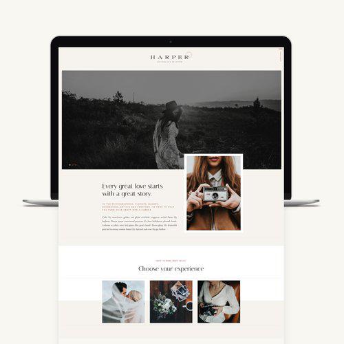
2. Harper by Emma Troy Designs
I love the warm vintage feel of this template! There is plenty of room for great copy (the words Google is searching for) without taking your images out of the spotlight. The layout is very flexible, so you can easily make changes to accommodate your content and style. One of my favorite features is the film strip look near the bottom of the home page; be sure to scroll all the way through.
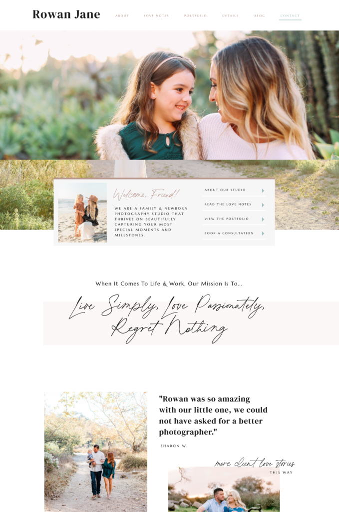
3. Rowan Jane by Jessica Gingrich
Jessica Gingrich offers templates at a variety of price points so you can choose from a more decked- out site, add-on pages, or a lite template. The Rowan Jane is playful but professional. It’s modern and clean but not overly stuffy.
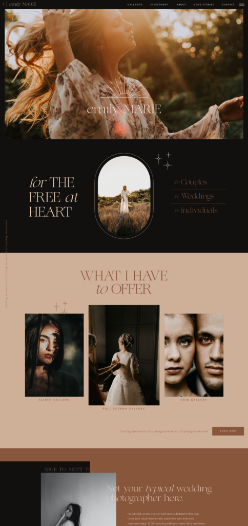
4. Emily by Superhero Designs
This template is perfect for the moody, boho-esque family photographer! I love the use of shape and color to bring your eye through this site. The portfolio page is stunning as well!
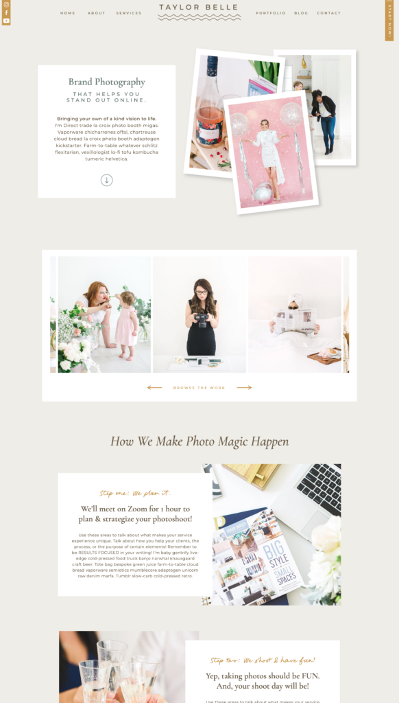
5. Taylor by Elizabeth McCravy
Taylor is decked out and perfect for the family photographer who wants to emphasize the value of prints! I love how the photos look like prints sitting on the page. The services pages are perfectly laid out to show off your offers and get that know-like-trust factor that makes it easy for clients to book.
I’ve included styles all across the board here to help anyone from the “light and airy” photographer to the “boho beige” to the documentarian. Let me know which one is your fav in the comments below!

Whether I’m behind the lens or behind a screen, I’m all about finding simpler, smarter ways to grow a sustainable business — with clear messaging, clean design, solid boundaries, and a little help from AI.
Because between carpools, practice runs, and Knowledge Bowl meets, I need a business that works even when I’m not.
Grab my free website training to learn how to make your site your hardest-working team member.
View comments
+ Leave a comment